Fluid Design Widget Types
Fluid design (often also called "responsive design") is a design principle under which the HTML content is created in such a fashion that it looks nice and readable on a variety of email clients, both with large and small screens, on computers and handheld devices.
To achieve this, fluid design uses special HTML features to create content and images in such a way that they automatically adjust their size, and sometimes even their layout, to "fluidly" correspond to the available display size. This often requires advanced HTML knowledge and also many trial and error tests with many different email clients and devices.
LISTSERV Maestro's fluid design widgets make fluid design much easier for you. You don't need to learn the latest HTML coding tricks and email client quirks because all of this knowledge is already built into the widgets themselves. You only need to select the right widget for the desired effect, and the advanced HTML code that is generated by the widget will automatically take care of the rest.
LISTSERV Maestro offers four main types of fluid design widgets that each have several variants. These widgets can be combined and nested to achieve various different fluid layout effects. For example you can start off with a 700 pixel width content box widget, to define your main message box, then nest a two-column layout widget inside of this main content box to generate a responsive two-column layout, then nest image/video box widgets into these two columns for illustrative images.
The following fluid design widgets are available:
- Content Box Widget
- Image/Video Box Widget
- Combined Image/Video & Content Box Widget
- Two Column Layout Widget
All fluid design widgets have also a custom tag representation in code mode.
See the fluid design widgets in action in the Fluid Design Widget Sample Video.
Content Box Widget
This widget is a general purpose content box widget that can contain any kind of nested content (including for example images, tables or other fluid design widgets).
The fluid layout behavior of a content box widget is defined by two parameters that are configured on the "Fluid
Design" tab of the widget's properties dialog. These two parameters define the width of the content box, by setting
a combined pixel and percent width: The content box will either have the configured pixel width or the configured
percent width (relative to the width of the containing parent), whichever is smaller.
For example, a box with
"300px or 50%" will resize itself so that, if possible, it is 300 pixels wide (and never larger), but it also never
takes up more than 50% of the parent width. Therefore, if necessary, it automatically shrinks to a size smaller than
300 pixels, if the parent itself is less than 600 pixels wide.
Summary: The content box widget will automatically shrink if the parent width requires it and grow if the width allows it, but will never grow to more than the allowed pixel width.
The widget properties dialog allows you to define text and background colors, paddings and border styles for the widget.
There are two main variants of the content box widget:
-
Without Surrounding Widget Box: The content box itself is not surrounded by an additional widget box. The widget therefore only takes up as much space as the width definition of the content box requires (as explained above). If this leaves unused space to the left or right of the widget, then the other content that is outside of the widget can flow "around" the widget's content box to take up this space.
The widget can be defined to be either left or right aligned (in its parent), so the surrounding content then flows around the content box on the other side.


-
With Surrounding Widget Box: The content box is nested into a surrounding widget box, which always takes up the full width of the parent element. However, the content box of the widget still takes up only as much space as the width definition of the content box requires (as explained above). If this leaves unused space to the left and/or right of the widget, then this unused space is inside of the surrounding widget box and therefore remains unused, as it cannot be used by the other content that is outside of the widget. Or in other words, the surrounding content cannot flow "around" the widget's content box.
The widget can be defined to be either left aligned, centered or right aligned in the surrounding widget box, so the unused space (if any) appears either on the right or the left or both.


A content box widget can always be switched between these variants via the "Layout" tab in its properties dialog.
In code mode, the content box widget is represented by the <widget-contentBox> custom tag.
See here for details.
Deviating behavior in Outlook: Because of the limited HTML support in Outlook, the behavior of the content box widget is different if viewed in Outlook. In Outlook, the content box width is fixed. It is always displayed with the specified pixel width. This width is not dynamically adjusted, no matter the Outlook window size.
Image/Video Box Widget
This widget is used to add an image or YouTube video to the HTML content that fluidly resizes itself according to the surrounding content and available space.
If the widget is used to add a video, then what is actually added to the content is a thumbnail image of the selected video, not the video itself. This thumbnail image in the content then acts as a clickable link to the video on YouTube. So in the case of a video, whenever the following explanation refers to the widget image, it means this thumbnail image.
The fluid layout behavior of an image/video box widget is defined by two parameters that are configured on the "Fluid Design"
tab of the widget's properties dialog. These two parameters define the width of the image, by setting a combined pixel
and percent width: The image will either have the configured pixel width or the
configured percent width (relative to the width of the containing parent), whichever is smaller.
For example,
an image with "200px or 33%" will resize itself so that, if possible, it is
200 pixels wide (and never larger), but it also never takes up more than 33% of the parent width. Therefore, if
necessary, it automatically shrinks to a size smaller than 200 pixels, if the parent itself is less than 600 pixels
wide.
Summary: The image/video box widget will automatically shrink if the parent width requires it and grow if the width allows it, but will never grow to more than the allowed pixel width.
The widget properties dialog allows you to define background colors, paddings and border styles for the widget. Via the properties, you can also add a link target URL to the image, so that the image becomes a clickable link, and enable an image caption that appears below the image.
There are two main variants of the image/video box widget:
-
Without Surrounding Widget Box: The image/video box itself is not surrounded by an additional widget box. The image therefore only takes up as much space as the width definition requires (as explained above). If this leaves unused space to the left or right of the image, then the other content that is outside of the image can flow "around" the image to take up this space.
The image can be defined to be either left or right aligned (in its parent), so the surrounding content then flows around the image on the other side.


-
With Surrounding Widget Box: The image/video box is nested into a surrounding widget box, which always takes up the full width of the parent element. However, the image itself still takes up only as much space as the width definition requires (as explained above). If this leaves unused space to the left and/or right of the image, then this unused space is inside of the surrounding widget box and therefore remains unused, as it cannot be used by the other content that is outside of the widget. Or in other words, the surrounding content cannot flow "around" the widget's image.
The image can be defined to be either left aligned, centered or right aligned in the surrounding widget box, so the unused space (if any) appears either on the right or the left or both.


An image/video box widget can always be switched between these variants via the "Layout" tab in its properties dialog.
In code mode, the image/video box widget is represented by the <widget-imageBox> custom tag.
See here for details.
Deviating behavior in Outlook: Because of the limited HTML support in Outlook, the behavior of the image/video box widget is different if viewed in Outlook. In Outlook, the image width is fixed. It is always displayed with the specified pixel width. This width is not dynamically adjusted, no matter the Outlook window size.
Combined Image/Video & Content Box Widget
This widget combines the main properties of the content box and image/video box widgets that were explained above. The widget has an image component similar to the image/video box widget, and it also has a content box component similar to the content box widget that can contain any kind of nested content (including other widgets).
If the widget is used to add a video, then what is actually added to the content is a thumbnail image of the selected video, not the video itself. This thumbnail image in the content then acts as a clickable link to the video on YouTube. So in the case of a video, whenever the following explanation refers to the widget image, it means this thumbnail image.
The widget itself consists of a main widget box that always takes up the full width of the surrounding parent
element. Inside of this widget box, the fluid layout behavior of such a combo widget is defined by two parameters that
are configured on the "Fluid Design" tab of the widget's properties dialog. These two parameters define the width of the
image part, by setting a combined pixel and percent width: The image will either
have the configured pixel width or the configured percent width (relative to the width of the containing parent),
whichever is smaller.
For example, an image with "200px or 33%" will resize
itself so that, if possible, it is 200 pixels wide (and never larger), but it also never takes up more than
33% of the parent width. Therefore, if necessary, it automatically shrinks to a size smaller than 200 pixels, if the
parent itself is less than 600 pixels wide.
The content part in turn will take up the rest of the main widget
box's space that is not used by the image.
Summary: The main widget box will automatically size itself to use the full available parent width. The image part of the widget will automatically shrink if the parent width requires it and grow if the width allows it, but will never grow to more than the allowed pixel width. The content part of the widget will arrange itself in the remaining widget space around the image part.
The widget properties dialog allows you to define background colors, paddings and border styles for the widget. Via the properties, you can also add a link target URL to the image, so that the image becomes a clickable link, and enable an image caption that appears below the image part of the widget.
There are two main variants of the combined image & content box widget:
-
Content Flows Around Image: The content that is defined in the content part of the widget flows around the image part, if possible. The image is either placed in the top-left or top-right corner of the surrounding widget box. The other widget content uses the available space beside the image (if any) and also the space below the image, as necessary, including the space directly below the image, thus "flowing" around the image.
The image can be defined to be either left or right aligned, so the surrounding content then flows around the image on the other side.


-
Content Does Not Flow Around Image: The content that is defined in the content part of the widget does not flow around the image part. The image is either placed in the top-left or top-right corner of the surrounding widget box. The other widget content uses the available space beside the image and, if necessary, streches down to use even more space than the image height allows, but never the space directly below the image, thus the content does not flow around the image.
The image can be defined to be either left or right aligned, so the surrounding content is then arranged beside the image on the other side.


A combined image & content box widget can always be switched between these variants via the "Layout" tab in its properties dialog.
In code mode, the content box widget is represented by the <widget-imageContentBox> custom tag.
See here for details.
Deviating behavior in Outlook: Because of the limited HTML support in Outlook, the behavior of the combined image & content box widget is different if viewed in Outlook. In Outlook, the width of the image part is fixed. It is always displayed with the specified pixel width. This width is not dynamically adjusted, no matter the Outlook window size.
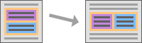
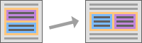
Two Column Layout Widget
This widget has two content boxes that automatically resize and rearrange themselves, either in a side-by-side or top-to-bottom layout, according to the surrounding content and available width. The content boxes can contain any kind of nested content (including for example images, tables or other fluid design widgets).
The widget itself consists of a main widget box that always takes up the full width of the surrounding parent element. Inside of this widget box, the two content boxes are arranged according to the choices on the "Fluid Design" and "Layout" tabs of the widget's properties dialog. By default, the two content boxes are shown in a top-to-bottom layout, with the first content box at the top and the second box after/below the first box at the bottom. But this default layout is only used if necessary. If possible, the two content boxes will automatically rearrange themselves to a side-by-side layout with two columns.
-
The smart side-by-side layout is automatically used in all compliant email clients, if the available window width is at least 640 pixels. Thus, in a large enough window (like on a computer monitor), if the email client supports it, the widget will automatically use the side-by-side layout.
-
The default top-to-bottom layout is used in all email clients if the available window width is less than 640 pixels. Thus, in a small (narrow) window, like for example a smartphone, but also on a large display but with a narrow email client window, the widget will automatically use the top-to-bottom default layout.
-
The top-to-bottom default layout is also always used in all non-compliant email clients, even if the available window width is 640 pixels or more.
In this sense, a compliant email client is an email client that supports the HTML standards that are necessary for the automatic transformation into the side-by-side layout. A non-compliant email client is a client with limited HTML standard support that therefore does not support this automatic transformation.
Summary: The main widget box will automatically size itself to use the full available parent width. The two content boxes will then automatically arrange themselves inside of the widget box, either in a side-by-side layout, if the email client supports it and the available window width is 640 pixels or more, or otherwise in a top-to-bottom layout.
The widget properties dialog allows you to define background colors, paddings and border styles for the widget.
It also gives you the choice over how the two content boxes shall arrange themselves if the side-by-side layout is chosen. Either the top box (in top-to-bottom layout) can become the left column, if the layout transforms to side-by side, or the bottom box can become the left column. In both cases, the other box becomes the right column.
And you can define the column sizing for the side-by-side column layout case: The two columns can be sized with either one of the predefined distribution ratios (1:2, 1:1 or 2:1) or with a custom distribution ratio*.


A two column layout widget can always be switched between these variants via the "Fluid Design" and "Layout" tabs in its properties dialog.
In code mode, the content box widget is represented by the <widget-twoColumn> custom tag.
See here for details.
Deviating behavior in Outlook: Because of the limited HTML support in Outlook, Outlook is a non-compliant email client. Therefore, in Outlook the widget will always use the default top-to-bottom layout and never the smart side-by-side layout, no matter the Outlook window size.
*) Note: If possible, LISTSERV Maestro reduces the custom distribution ratio you enter, similar to mathematically reducing
a fraction. For example 4:2 is reduced to 2:1. Additionally, LISTSERV Maestro may reduce the
ratio in a not strictly mathematical fashion, if the reduced ratio actually results in the same percentage sizes for
the left and right column. For example 7:43 is reduced to 1:6 even though that is not a
proper mathematical reduction, because both 7:43 and 1:6 result, after rounding, in the
same percentage sizes (14% and 86%).
Also, if you enter a ratio that would result in one of the columns getting a width of less than 10%, then the
ratio set to the nearest 1:9 or 9:1 ratio, so that the smaller of the two columns
always has a width of at least 10%.
Fluid Design Widget Sample Video
The following video shows how a fluid and responsive HTML newsletter is created from scratch, using LISTSERV Maestro's fluid design widgets: